Unsupervised Learning#
![]()
In this lab we demonstrate PCA and clustering on several datasets. As in other labs, we import some of our libraries at this top level. This makes the code more readable, as scanning the first few lines of the notebook tells us what libraries are used in this notebook.
import numpy as np
import pandas as pd
import matplotlib.pyplot as plt
from statsmodels.datasets import get_rdataset
from sklearn.decomposition import PCA
from sklearn.preprocessing import StandardScaler
from ISLP import load_data
We also collect the new imports needed for this lab.
from sklearn.cluster import \
     (KMeans,
      AgglomerativeClustering)
from scipy.cluster.hierarchy import \
     (dendrogram,
      cut_tree)
from ISLP.cluster import compute_linkage
Principal Components Analysis#
In this lab, we perform PCA on USArrests, a data set in the
R computing environment.
We retrieve the data using get_rdataset(), which can fetch data from
many standard R packages.
The rows of the data set contain the 50 states, in alphabetical order.
USArrests = get_rdataset('USArrests').data
USArrests
| Murder | Assault | UrbanPop | Rape | |
|---|---|---|---|---|
| rownames | ||||
| Alabama | 13.2 | 236 | 58 | 21.2 |
| Alaska | 10.0 | 263 | 48 | 44.5 |
| Arizona | 8.1 | 294 | 80 | 31.0 |
| Arkansas | 8.8 | 190 | 50 | 19.5 |
| California | 9.0 | 276 | 91 | 40.6 |
| Colorado | 7.9 | 204 | 78 | 38.7 |
| Connecticut | 3.3 | 110 | 77 | 11.1 |
| Delaware | 5.9 | 238 | 72 | 15.8 |
| Florida | 15.4 | 335 | 80 | 31.9 |
| Georgia | 17.4 | 211 | 60 | 25.8 |
| Hawaii | 5.3 | 46 | 83 | 20.2 |
| Idaho | 2.6 | 120 | 54 | 14.2 |
| Illinois | 10.4 | 249 | 83 | 24.0 |
| Indiana | 7.2 | 113 | 65 | 21.0 |
| Iowa | 2.2 | 56 | 57 | 11.3 |
| Kansas | 6.0 | 115 | 66 | 18.0 |
| Kentucky | 9.7 | 109 | 52 | 16.3 |
| Louisiana | 15.4 | 249 | 66 | 22.2 |
| Maine | 2.1 | 83 | 51 | 7.8 |
| Maryland | 11.3 | 300 | 67 | 27.8 |
| Massachusetts | 4.4 | 149 | 85 | 16.3 |
| Michigan | 12.1 | 255 | 74 | 35.1 |
| Minnesota | 2.7 | 72 | 66 | 14.9 |
| Mississippi | 16.1 | 259 | 44 | 17.1 |
| Missouri | 9.0 | 178 | 70 | 28.2 |
| Montana | 6.0 | 109 | 53 | 16.4 |
| Nebraska | 4.3 | 102 | 62 | 16.5 |
| Nevada | 12.2 | 252 | 81 | 46.0 |
| New Hampshire | 2.1 | 57 | 56 | 9.5 |
| New Jersey | 7.4 | 159 | 89 | 18.8 |
| New Mexico | 11.4 | 285 | 70 | 32.1 |
| New York | 11.1 | 254 | 86 | 26.1 |
| North Carolina | 13.0 | 337 | 45 | 16.1 |
| North Dakota | 0.8 | 45 | 44 | 7.3 |
| Ohio | 7.3 | 120 | 75 | 21.4 |
| Oklahoma | 6.6 | 151 | 68 | 20.0 |
| Oregon | 4.9 | 159 | 67 | 29.3 |
| Pennsylvania | 6.3 | 106 | 72 | 14.9 |
| Rhode Island | 3.4 | 174 | 87 | 8.3 |
| South Carolina | 14.4 | 279 | 48 | 22.5 |
| South Dakota | 3.8 | 86 | 45 | 12.8 |
| Tennessee | 13.2 | 188 | 59 | 26.9 |
| Texas | 12.7 | 201 | 80 | 25.5 |
| Utah | 3.2 | 120 | 80 | 22.9 |
| Vermont | 2.2 | 48 | 32 | 11.2 |
| Virginia | 8.5 | 156 | 63 | 20.7 |
| Washington | 4.0 | 145 | 73 | 26.2 |
| West Virginia | 5.7 | 81 | 39 | 9.3 |
| Wisconsin | 2.6 | 53 | 66 | 10.8 |
| Wyoming | 6.8 | 161 | 60 | 15.6 |
The columns of the data set contain the four variables.
USArrests.columns
Index(['Murder', 'Assault', 'UrbanPop', 'Rape'], dtype='str')
We first briefly examine the data. We notice that the variables have vastly different means.
USArrests.mean()
Murder        7.788
Assault     170.760
UrbanPop     65.540
Rape         21.232
dtype: float64
Dataframes have several useful methods for computing
column-wise summaries. We can also examine the
variance of the four variables using the var() method.
USArrests.var()
Murder        18.970465
Assault     6945.165714
UrbanPop     209.518776
Rape          87.729159
dtype: float64
Not surprisingly, the variables also have vastly different variances.
The UrbanPop variable measures the percentage of the population
in each state living in an urban area, which is not a comparable
number to the number of rapes in each state per 100,000 individuals.
PCA looks for derived variables that account for most of the variance in the data set.
If we do not scale the variables before performing PCA, then the principal components
would mostly be driven by the
Assault variable, since it has by far the largest
variance. So if the variables are measured in different units or vary widely in scale, it is recommended to standardize the variables to have standard deviation one before performing PCA.
Typically we set the means to zero as well.
This scaling can be done via the StandardScaler() transform imported above. We first fit the
scaler, which computes the necessary means and standard
deviations and then apply it to our data using the
transform method. As before, we combine these steps using the fit_transform() method.
scaler = StandardScaler(with_std=True,
                        with_mean=True)
USArrests_scaled = scaler.fit_transform(USArrests)
Having scaled the data, we can then
perform principal components analysis using the PCA() transform
from the sklearn.decomposition package.
pcaUS = PCA()
(By default, the PCA() transform centers the variables to have
mean zero though it does not scale them.) The transform pcaUS
can be used to find the PCA
scores returned by fit(). Once the fit method has been called, the pcaUS object also contains a number of useful quantities.
pcaUS.fit(USArrests_scaled)
PCA()In a Jupyter environment, please rerun this cell to show the HTML representation or trust the notebook.
On GitHub, the HTML representation is unable to render, please try loading this page with nbviewer.org.
Parameters
After fitting, the mean_ attribute corresponds to the means
of the variables. In this case, since we centered and scaled the data with
scaler() the means will all be 0.
pcaUS.mean_
array([-7.10542736e-17, 1.38777878e-16, -4.39648318e-16, 8.59312621e-16])
The scores can be computed using the transform() method
of pcaUS after it has been fit.
scores = pcaUS.transform(USArrests_scaled)
We will plot these scores a bit further down.
The components_ attribute provides the principal component loadings:
each row of pcaUS.components_ contains the corresponding
principal component loading vector.
pcaUS.components_
array([[ 0.53589947,  0.58318363,  0.27819087,  0.54343209],
       [-0.41818087, -0.1879856 ,  0.87280619,  0.16731864],
       [-0.34123273, -0.26814843, -0.37801579,  0.81777791],
       [-0.6492278 ,  0.74340748, -0.13387773, -0.08902432]])
The biplot is a common visualization method used with
PCA. It is not built in as a standard
part of sklearn, though there are python
packages that do produce such plots. Here we
make a simple biplot manually.
i, j = 0, 1 # which components
fig, ax = plt.subplots(1, 1, figsize=(8, 8))
ax.scatter(scores[:,0], scores[:,1])
ax.set_xlabel('PC%d' % (i+1))
ax.set_ylabel('PC%d' % (j+1))
for k in range(pcaUS.components_.shape[1]):
    ax.arrow(0, 0, pcaUS.components_[i,k], pcaUS.components_[j,k])
    ax.text(pcaUS.components_[i,k],
            pcaUS.components_[j,k],
            USArrests.columns[k])
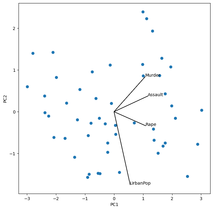
Notice that this figure is a reflection of Figure 12.1 through the \(y\)-axis. Recall that the principal components are only unique up to a sign change, so we can reproduce that figure by flipping the signs of the second set of scores and loadings. We also increase the length of the arrows to emphasize the loadings.
scale_arrow = s_ = 2
scores[:,1] *= -1
pcaUS.components_[1] *= -1 # flip the y-axis
fig, ax = plt.subplots(1, 1, figsize=(8, 8))
ax.scatter(scores[:,0], scores[:,1])
ax.set_xlabel('PC%d' % (i+1))
ax.set_ylabel('PC%d' % (j+1))
for k in range(pcaUS.components_.shape[1]):
    ax.arrow(0, 0, s_*pcaUS.components_[i,k], s_*pcaUS.components_[j,k])
    ax.text(s_*pcaUS.components_[i,k],
            s_*pcaUS.components_[j,k],
            USArrests.columns[k])
The standard deviations of the principal component scores are as follows:
scores.std(0, ddof=1)
array([1.5908673 , 1.00496987, 0.6031915 , 0.4206774 ])
The variance of each score can be extracted directly from the pcaUS object via
the explained_variance_ attribute.
pcaUS.explained_variance_
array([2.53085875, 1.00996444, 0.36383998, 0.17696948])
The proportion of variance explained by each principal
component (PVE) is stored as explained_variance_ratio_:
pcaUS.explained_variance_ratio_
array([0.62006039, 0.24744129, 0.0891408 , 0.04335752])
We see that the first principal component explains 62.0% of the variance in the data, the next principal component explains 24.7% of the variance, and so forth. We can plot the PVE explained by each component, as well as the cumulative PVE. We first plot the proportion of variance explained.
%%capture
fig, axes = plt.subplots(1, 2, figsize=(15, 6))
ticks = np.arange(pcaUS.n_components_)+1
ax = axes[0]
ax.plot(ticks,
        pcaUS.explained_variance_ratio_,
        marker='o')
ax.set_xlabel('Principal Component');
ax.set_ylabel('Proportion of Variance Explained')
ax.set_ylim([0,1])
ax.set_xticks(ticks)
Notice the use of %%capture, which suppresses the displaying of the partially completed figure.
ax = axes[1]
ax.plot(ticks,
        pcaUS.explained_variance_ratio_.cumsum(),
        marker='o')
ax.set_xlabel('Principal Component')
ax.set_ylabel('Cumulative Proportion of Variance Explained')
ax.set_ylim([0, 1])
ax.set_xticks(ticks)
fig
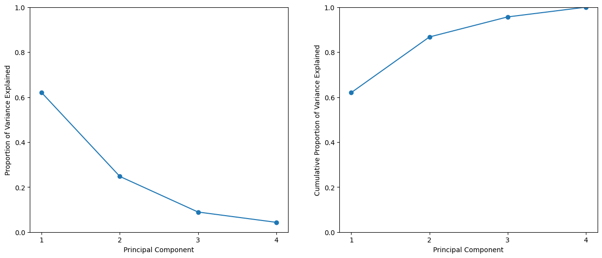
The result is similar to that shown in Figure 12.3. Note
that the method cumsum() computes the cumulative sum of
the elements of a numeric vector. For instance:
a = np.array([1,2,8,-3])
np.cumsum(a)
array([ 1, 3, 11, 8])
Matrix Completion#
We now re-create the analysis carried out on the USArrests data in
Section 12.3.
We saw in Section 12.2.2 that solving the optimization
problem~(12.6) on a centered data matrix \(\bf X\) is
equivalent to computing the first \(M\) principal
components of the data. We use our scaled
and centered USArrests data as \(\bf X\) below. The singular value decomposition
(SVD) is a general algorithm for solving
(12.6).
X = USArrests_scaled
U, D, V = np.linalg.svd(X, full_matrices=False)
U.shape, D.shape, V.shape
((50, 4), (4,), (4, 4))
The np.linalg.svd() function returns three components, U, D and V. The matrix V is equivalent to the
loading matrix from principal components (up to an unimportant sign flip). Using the full_matrices=False option ensures that
for a tall matrix the shape of U is the same as the shape of X.
V
array([[-0.53589947, -0.58318363, -0.27819087, -0.54343209],
       [ 0.41818087,  0.1879856 , -0.87280619, -0.16731864],
       [-0.34123273, -0.26814843, -0.37801579,  0.81777791],
       [ 0.6492278 , -0.74340748,  0.13387773,  0.08902432]])
pcaUS.components_
array([[ 0.53589947,  0.58318363,  0.27819087,  0.54343209],
       [ 0.41818087,  0.1879856 , -0.87280619, -0.16731864],
       [-0.34123273, -0.26814843, -0.37801579,  0.81777791],
       [-0.6492278 ,  0.74340748, -0.13387773, -0.08902432]])
The matrix U corresponds to a standardized version of the PCA score matrix (each column standardized to have sum-of-squares one). If we multiply each column of U by the corresponding element of D, we recover the PCA scores exactly (up to a meaningless sign flip).
(U * D[None,:])[:3]
array([[-0.98556588,  1.13339238, -0.44426879,  0.15626714],
       [-1.95013775,  1.07321326,  2.04000333, -0.43858344],
       [-1.76316354, -0.74595678,  0.05478082, -0.83465292]])
scores[:3]
array([[ 0.98556588,  1.13339238, -0.44426879, -0.15626714],
       [ 1.95013775,  1.07321326,  2.04000333,  0.43858344],
       [ 1.76316354, -0.74595678,  0.05478082,  0.83465292]])
While it would be possible to carry out this lab using the PCA() estimator,
here we use the np.linalg.svd() function in order to illustrate its use.
We now omit 20 entries in the \(50\times 4\) data matrix at random. We do so by first selecting 20 rows (states) at random, and then selecting one of the four entries in each row at random. This ensures that every row has at least three observed values.
n_omit = 20
np.random.seed(15)
r_idx = np.random.choice(np.arange(X.shape[0]),
                         n_omit,
                         replace=False)
c_idx = np.random.choice(np.arange(X.shape[1]),
                         n_omit,
                         replace=True)
Xna = X.copy()
Xna[r_idx, c_idx] = np.nan
Here the array r_idx
contains 20 integers from 0 to 49; this represents the states (rows of X) that are selected to contain missing values. And c_idx contains
20 integers from 0 to 3, representing the features (columns in X) that contain the missing values for each of the selected states.
We now write some code to implement Algorithm 12.1.
We first write a function that takes in a matrix, and returns an approximation to the matrix using the svd() function.
This will be needed in Step 2 of Algorithm 12.1.
def low_rank(X, M=1):
    U, D, V = np.linalg.svd(X)
    L = U[:,:M] * D[None,:M]
    return L.dot(V[:M])
To conduct Step 1 of the algorithm, we initialize Xhat — this is \(\tilde{\bf X}\) in Algorithm 12.1 — by replacing
the missing values with the column means of the non-missing entries. These are stored in
Xbar below after running np.nanmean() over the row axis.
We make a copy so that when we assign values to Xhat below we do not also overwrite the
values in Xna.
Xhat = Xna.copy()
Xbar = np.nanmean(Xhat, axis=0)
Xhat[r_idx, c_idx] = Xbar[c_idx]
Before we begin Step 2, we set ourselves up to measure the progress of our iterations:
thresh = 1e-7
rel_err = 1
count = 0
ismiss = np.isnan(Xna)
mssold = np.mean(Xhat[~ismiss]**2)
mss0 = np.mean(Xna[~ismiss]**2)
Here ismiss is a logical matrix with the same dimensions as Xna;
a given element is True if the corresponding matrix element is missing. The notation ~ismiss negates this boolean vector. This is useful
because it allows us to access both the missing and non-missing entries. We store the mean of the squared non-missing elements in mss0.
We store the mean squared error of the non-missing elements of the old version of Xhat in mssold (which currently
agrees with mss0). We plan to store the mean squared error of the non-missing elements of the current version of Xhat in mss, and will then
iterate Step 2 of Algorithm 12.1 until the relative error, defined as
(mssold - mss) / mss0, falls below thresh = 1e-7.
{Algorithm 12.1 tells us to iterate Step 2 until 12.14 is no longer decreasing. Determining whether 12.14 is decreasing requires us only to keep track of mssold - mss. However, in practice, we keep track of (mssold - mss) / mss0 instead: this makes it so that the number of iterations required for Algorithm 12.1 to converge does not depend on whether we multiplied the raw data \(\bf X\) by a constant factor.}
In Step 2(a) of Algorithm 12.1, we approximate Xhat using low_rank(); we call this Xapp. In Step 2(b), we use Xapp to update the estimates for elements in Xhat that are missing in Xna. Finally, in Step 2(c), we compute the relative error. These three steps are contained in the following while loop:
while rel_err > thresh:
    count += 1
    # Step 2(a)
    Xapp = low_rank(Xhat, M=1)
    # Step 2(b)
    Xhat[ismiss] = Xapp[ismiss]
    # Step 2(c)
    mss = np.mean(((Xna - Xapp)[~ismiss])**2)
    rel_err = (mssold - mss) / mss0
    mssold = mss
    print("Iteration: {0}, MSS:{1:.3f}, Rel.Err {2:.2e}"
          .format(count, mss, rel_err))
Iteration: 1, MSS:0.395, Rel.Err 5.99e-01
Iteration: 2, MSS:0.382, Rel.Err 1.33e-02
Iteration: 3, MSS:0.381, Rel.Err 1.44e-03
Iteration: 4, MSS:0.381, Rel.Err 1.79e-04
Iteration: 5, MSS:0.381, Rel.Err 2.58e-05
Iteration: 6, MSS:0.381, Rel.Err 4.22e-06
Iteration: 7, MSS:0.381, Rel.Err 7.65e-07
Iteration: 8, MSS:0.381, Rel.Err 1.48e-07
Iteration: 9, MSS:0.381, Rel.Err 2.95e-08
We see that after eight iterations, the relative error has fallen below thresh = 1e-7, and so the algorithm terminates. When this happens, the mean squared error of the non-missing elements equals 0.381.
Finally, we compute the correlation between the 20 imputed values and the actual values:
np.corrcoef(Xapp[ismiss], X[ismiss])[0,1]
np.float64(0.7113567434297361)
In this lab, we implemented Algorithm 12.1 ourselves for didactic purposes. However, a reader who wishes to apply matrix completion to their data might look to more specialized Python{} implementations.
Clustering#
$K$-Means Clustering#
The estimator sklearn.cluster.KMeans() performs \(K\)-means clustering in
Python. We begin with a simple simulated example in which there
truly are two clusters in the data: the first 25 observations have a
mean shift relative to the next 25 observations.
np.random.seed(0);
X = np.random.standard_normal((50,2));
X[:25,0] += 3;
X[:25,1] -= 4;
We now perform \(K\)-means clustering with \(K=2\).
kmeans = KMeans(n_clusters=2,
                random_state=2,
                n_init=20).fit(X)
We specify random_state to make the results reproducible. The cluster assignments of the 50 observations are contained in kmeans.labels_.
kmeans.labels_
array([0, 0, 0, 0, 0, 0, 0, 0, 0, 0, 0, 0, 0, 0, 0, 0, 0, 0, 0, 0, 0, 1,
       0, 0, 0, 1, 1, 1, 1, 1, 1, 1, 1, 1, 1, 1, 1, 1, 1, 1, 1, 1, 1, 1,
       1, 1, 1, 1, 1, 1], dtype=int32)
The \(K\)-means clustering perfectly separated the observations into two
clusters even though we did not supply any group information to
KMeans(). We can plot the data, with each observation
colored according to its cluster assignment.
fig, ax = plt.subplots(1, 1, figsize=(8,8))
ax.scatter(X[:,0], X[:,1], c=kmeans.labels_)
ax.set_title("K-Means Clustering Results with K=2");
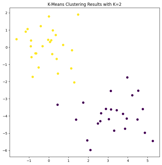
Here the observations can be easily plotted because they are two-dimensional. If there were more than two variables then we could instead perform PCA and plot the first two principal component score vectors to represent the clusters.
In this example, we knew that there really were two clusters because we generated the data. However, for real data, we do not know the true number of clusters, nor whether they exist in any precise way. We could instead have performed \(K\)-means clustering on this example with \(K=3\).
kmeans = KMeans(n_clusters=3,
                random_state=3,
                n_init=20).fit(X)
fig, ax = plt.subplots(figsize=(8,8))
ax.scatter(X[:,0], X[:,1], c=kmeans.labels_)
ax.set_title("K-Means Clustering Results with K=3");
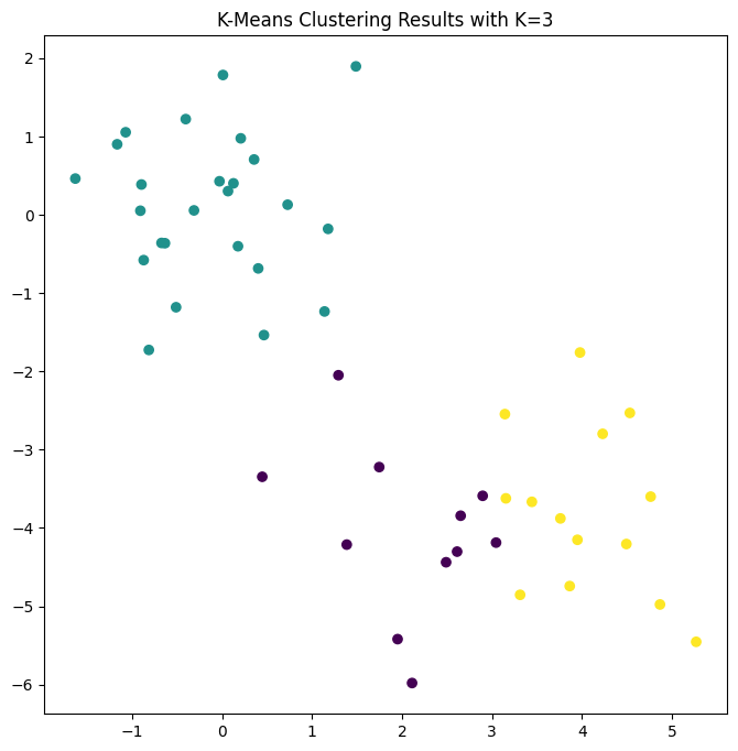
When \(K=3\), \(K\)-means clustering splits up the two clusters.
We have used the n_init argument to run the \(K\)-means with 20
initial cluster assignments (the default is 10). If a
value of n_init greater than one is used, then \(K\)-means
clustering will be performed using multiple random assignments in
Step 1 of Algorithm 12.2, and the KMeans()
function will report only the best results. Here we compare using
n_init=1 to n_init=20.
kmeans1 = KMeans(n_clusters=3,
                random_state=3,
                n_init=1).fit(X)
kmeans20 = KMeans(n_clusters=3,
                  random_state=3,
                  n_init=20).fit(X);
kmeans1.inertia_, kmeans20.inertia_
(76.85131986999252, 75.06261242745384)
Note that kmeans.inertia_ is the total within-cluster sum
of squares, which we seek to minimize by performing \(K\)-means
clustering 12.17.
We strongly recommend always running \(K\)-means clustering with
a large value of n_init, such as 20 or 50, since otherwise an
undesirable local optimum may be obtained.
When performing \(K\)-means clustering, in addition to using multiple
initial cluster assignments, it is also important to set a random seed
using the random_state argument to KMeans(). This way, the initial
cluster assignments in Step 1 can be replicated, and the \(K\)-means
output will be fully reproducible.
Hierarchical Clustering#
The AgglomerativeClustering() class from
the sklearn.clustering package implements hierarchical clustering.
As its
name is long, we use the short hand HClust for hierarchical clustering. Note that this will not change the return type
when using this method, so instances will still be of class AgglomerativeClustering.
In the following example we use the data from the previous lab to plot the hierarchical clustering
dendrogram using complete, single, and average linkage clustering
with Euclidean distance as the dissimilarity measure. We begin by
clustering observations using complete linkage.
HClust = AgglomerativeClustering
hc_comp = HClust(distance_threshold=0,
                 n_clusters=None,
                 linkage='complete')
hc_comp.fit(X)
AgglomerativeClustering(distance_threshold=0, linkage='complete',
                        n_clusters=None)
In a Jupyter environment, please rerun this cell to show the HTML representation or trust the notebook. On GitHub, the HTML representation is unable to render, please try loading this page with nbviewer.org.
Parameters
This computes the entire dendrogram. We could just as easily perform hierarchical clustering with average or single linkage instead:
hc_avg = HClust(distance_threshold=0,
                n_clusters=None,
                linkage='average');
hc_avg.fit(X)
hc_sing = HClust(distance_threshold=0,
                 n_clusters=None,
                 linkage='single');
hc_sing.fit(X);
To use a precomputed distance matrix, we provide an additional
argument metric="precomputed". In the code below, the first four lines computes the \(50\times 50\) pairwise-distance matrix.
D = np.zeros((X.shape[0], X.shape[0]));
for i in range(X.shape[0]):
    x_ = np.multiply.outer(np.ones(X.shape[0]), X[i])
    D[i] = np.sqrt(np.sum((X - x_)**2, 1));
hc_sing_pre = HClust(distance_threshold=0,
                     n_clusters=None,
                     metric='precomputed',
                     linkage='single')
hc_sing_pre.fit(D)
AgglomerativeClustering(distance_threshold=0, linkage='single',
                        metric='precomputed', n_clusters=None)
In a Jupyter environment, please rerun this cell to show the HTML representation or trust the notebook. On GitHub, the HTML representation is unable to render, please try loading this page with nbviewer.org.
Parameters
We use
dendrogram() from scipy.cluster.hierarchy to plot the dendrogram. However,
dendrogram() expects a so-called linkage-matrix representation
of the clustering, which is not provided by AgglomerativeClustering(),
but can be computed. The function compute_linkage() in the
ISLP.cluster package is provided for this purpose.
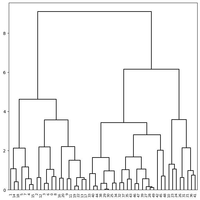
We can now plot the dendrograms. The numbers at the bottom of the plot
identify each observation. The dendrogram() function has a default method to
color different branches of the tree that suggests a pre-defined cut of the tree at a particular depth.
We prefer to overwrite this default by setting this threshold to be infinite. Since we want this behavior for many dendrograms, we store these values in a dictionary cargs and pass this as keyword arguments using the notation **cargs.
cargs = {'color_threshold':-np.inf,
         'above_threshold_color':'black'}
linkage_comp = compute_linkage(hc_comp)
fig, ax = plt.subplots(1, 1, figsize=(8, 8))
dendrogram(linkage_comp,
           ax=ax,
           **cargs);
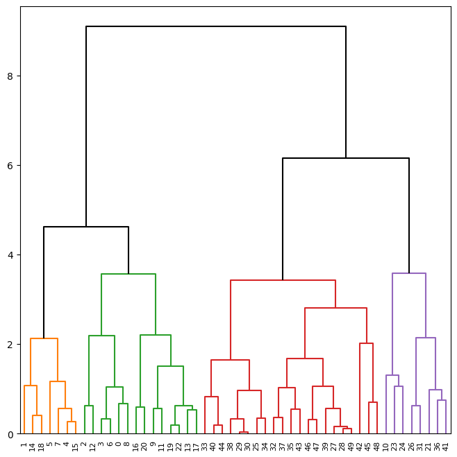
We may want to color branches of the tree above
and below a cut-threshold differently. This can be achieved
by changing the color_threshold. Let’s cut the tree at a height of 4,
coloring links that merge above 4 in black.
fig, ax = plt.subplots(1, 1, figsize=(8, 8))
dendrogram(linkage_comp,
           ax=ax,
           color_threshold=4,
           above_threshold_color='black');
To determine the cluster labels for each observation associated with a
given cut of the dendrogram, we can use the cut_tree()
function from scipy.cluster.hierarchy:
cut_tree(linkage_comp, n_clusters=4).T
array([[0, 1, 0, 0, 1, 1, 0, 1, 0, 0, 2, 0, 0, 0, 1, 1, 0, 0, 1, 0, 0, 2,
        0, 2, 2, 3, 2, 3, 3, 3, 3, 2, 3, 3, 3, 3, 2, 3, 3, 3, 3, 2, 3, 3,
        3, 3, 3, 3, 3, 3]])
This can also be achieved by providing an argument n_clusters
to HClust(); however each cut would require recomputing
the clustering. Similarly, trees may be cut by distance threshold
with an argument of distance_threshold to HClust()
or height to cut_tree().
cut_tree(linkage_comp, height=5)
array([[0],
       [0],
       [0],
       [0],
       [0],
       [0],
       [0],
       [0],
       [0],
       [0],
       [1],
       [0],
       [0],
       [0],
       [0],
       [0],
       [0],
       [0],
       [0],
       [0],
       [0],
       [1],
       [0],
       [1],
       [1],
       [2],
       [1],
       [2],
       [2],
       [2],
       [2],
       [1],
       [2],
       [2],
       [2],
       [2],
       [1],
       [2],
       [2],
       [2],
       [2],
       [1],
       [2],
       [2],
       [2],
       [2],
       [2],
       [2],
       [2],
       [2]])
To scale the variables before performing hierarchical clustering of
the observations, we use StandardScaler() as in our PCA example:
scaler = StandardScaler()
X_scale = scaler.fit_transform(X)
hc_comp_scale = HClust(distance_threshold=0,
n_clusters=None,
linkage='complete').fit(X_scale)
linkage_comp_scale = compute_linkage(hc_comp_scale)
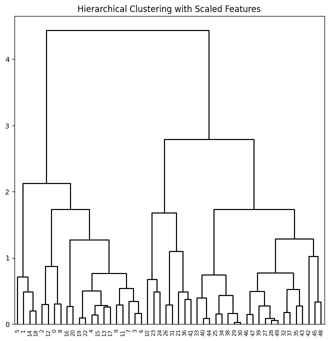
fig, ax = plt.subplots(1, 1, figsize=(8, 8))
dendrogram(linkage_comp_scale, ax=ax, **cargs)
ax.set_title("Hierarchical Clustering with Scaled Features");
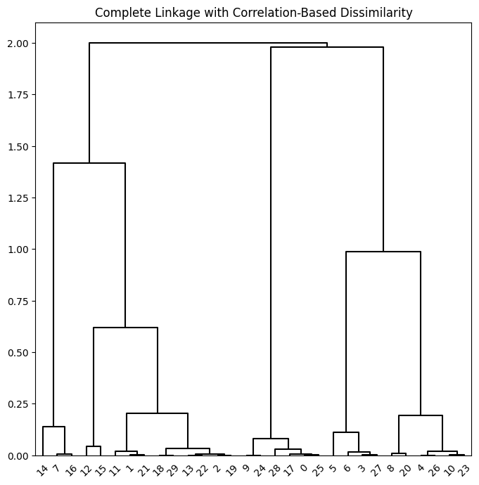
Correlation-based distances between observations can be used for clustering. The correlation between two observations measures the similarity of their feature values. {Suppose each observation has \(p\) features, each a single numerical value. We measure the similarity of two such observations by computing the correlation of these \(p\) pairs of numbers.} With \(n\) observations, the \(n\times n\) correlation matrix can then be used as a similarity (or affinity) matrix, i.e. so that one minus the correlation matrix is the dissimilarity matrix used for clustering.
Note that using correlation only makes sense for data with at least three features since the absolute correlation between any two observations with measurements on two features is always one. Hence, we will cluster a three-dimensional data set.
X = np.random.standard_normal((30, 3))
corD = 1 - np.corrcoef(X)
hc_cor = HClust(linkage='complete',
                distance_threshold=0,
                n_clusters=None,
                metric='precomputed')
hc_cor.fit(corD)
linkage_cor = compute_linkage(hc_cor)
fig, ax = plt.subplots(1, 1, figsize=(8, 8))
dendrogram(linkage_cor, ax=ax, **cargs)
ax.set_title("Complete Linkage with Correlation-Based Dissimilarity");
NCI60 Data Example#
Unsupervised techniques are often used in the analysis of genomic
data. In particular, PCA and hierarchical clustering are popular
tools. We illustrate these techniques on the NCI60 cancer cell line
microarray data, which consists of 6830 gene expression
measurements on 64 cancer cell lines.
NCI60 = load_data('NCI60')
nci_labs = NCI60['labels']
nci_data = NCI60['data']
Each cell line is labeled with a cancer type. We do not make use of the cancer types in performing PCA and clustering, as these are unsupervised techniques. But after performing PCA and clustering, we will check to see the extent to which these cancer types agree with the results of these unsupervised techniques.
The data has 64 rows and 6830 columns.
nci_data.shape
(64, 6830)
We begin by examining the cancer types for the cell lines.
nci_labs.value_counts()
label
RENAL          9
NSCLC          9
MELANOMA       8
BREAST         7
COLON          7
OVARIAN        6
LEUKEMIA       6
CNS            5
PROSTATE       2
UNKNOWN        1
K562B-repro    1
K562A-repro    1
MCF7A-repro    1
MCF7D-repro    1
Name: count, dtype: int64
PCA on the NCI60 Data#
We first perform PCA on the data after scaling the variables (genes) to have standard deviation one, although here one could reasonably argue that it is better not to scale the genes as they are measured in the same units.
scaler = StandardScaler()
nci_scaled = scaler.fit_transform(nci_data)
nci_pca = PCA()
nci_scores = nci_pca.fit_transform(nci_scaled)
We now plot the first few principal component score vectors, in order to visualize the data. The observations (cell lines) corresponding to a given cancer type will be plotted in the same color, so that we can see to what extent the observations within a cancer type are similar to each other.
cancer_types = list(np.unique(nci_labs))
nci_groups = np.array([cancer_types.index(lab)
                       for lab in nci_labs.values])
fig, axes = plt.subplots(1, 2, figsize=(15,6))
ax = axes[0]
ax.scatter(nci_scores[:,0],
           nci_scores[:,1],
           c=nci_groups,
           marker='o',
           s=50)
ax.set_xlabel('PC1'); ax.set_ylabel('PC2')
ax = axes[1]
ax.scatter(nci_scores[:,0],
           nci_scores[:,2],
           c=nci_groups,
           marker='o',
           s=50)
ax.set_xlabel('PC1'); ax.set_ylabel('PC3');
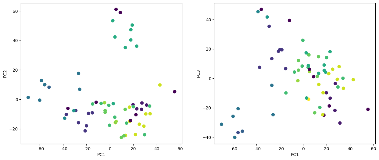
On the whole, cell lines corresponding to a single cancer type do tend to have similar values on the first few principal component score vectors. This indicates that cell lines from the same cancer type tend to have pretty similar gene expression levels.
We can also plot the percent variance
explained by the principal components as well as the cumulative percent variance explained.
This is similar to the plots we made earlier for the USArrests data.
fig, axes = plt.subplots(1, 2, figsize=(15,6))
ax = axes[0]
ticks = np.arange(nci_pca.n_components_)+1
ax.plot(ticks,
        nci_pca.explained_variance_ratio_,
        marker='o')
ax.set_xlabel('Principal Component');
ax.set_ylabel('PVE')
ax = axes[1]
ax.plot(ticks,
        nci_pca.explained_variance_ratio_.cumsum(),
        marker='o');
ax.set_xlabel('Principal Component')
ax.set_ylabel('Cumulative PVE');
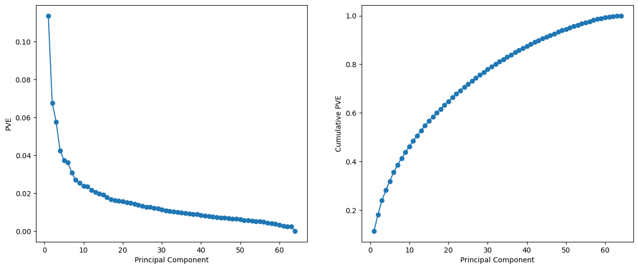
We see that together, the first seven principal components explain around 40% of the variance in the data. This is not a huge amount of the variance. However, looking at the scree plot, we see that while each of the first seven principal components explain a substantial amount of variance, there is a marked decrease in the variance explained by further principal components. That is, there is an elbow in the plot after approximately the seventh principal component. This suggests that there may be little benefit to examining more than seven or so principal components (though even examining seven principal components may be difficult).
Clustering the Observations of the NCI60 Data#
We now perform hierarchical clustering of the cell lines in the NCI60 data using
complete, single, and average linkage. Once again, the goal is to find out whether or not the observations cluster into distinct types of cancer. Euclidean
distance is used as the dissimilarity measure. We first write a short
function to produce
the three dendrograms.
def plot_nci(linkage, ax, cut=-np.inf):
    cargs = {'above_threshold_color':'black',
             'color_threshold':cut}
    hc = HClust(n_clusters=None,
                distance_threshold=0,
                linkage=linkage.lower()).fit(nci_scaled)
    linkage_ = compute_linkage(hc)
    dendrogram(linkage_,
               ax=ax,
               labels=np.asarray(nci_labs),
               leaf_font_size=10,
               **cargs)
    ax.set_title('%s Linkage' % linkage)
    return hc
Let’s plot our results.
fig, axes = plt.subplots(3, 1, figsize=(15,30))
ax = axes[0]; hc_comp = plot_nci('Complete', ax)
ax = axes[1]; hc_avg = plot_nci('Average', ax)
ax = axes[2]; hc_sing = plot_nci('Single', ax)
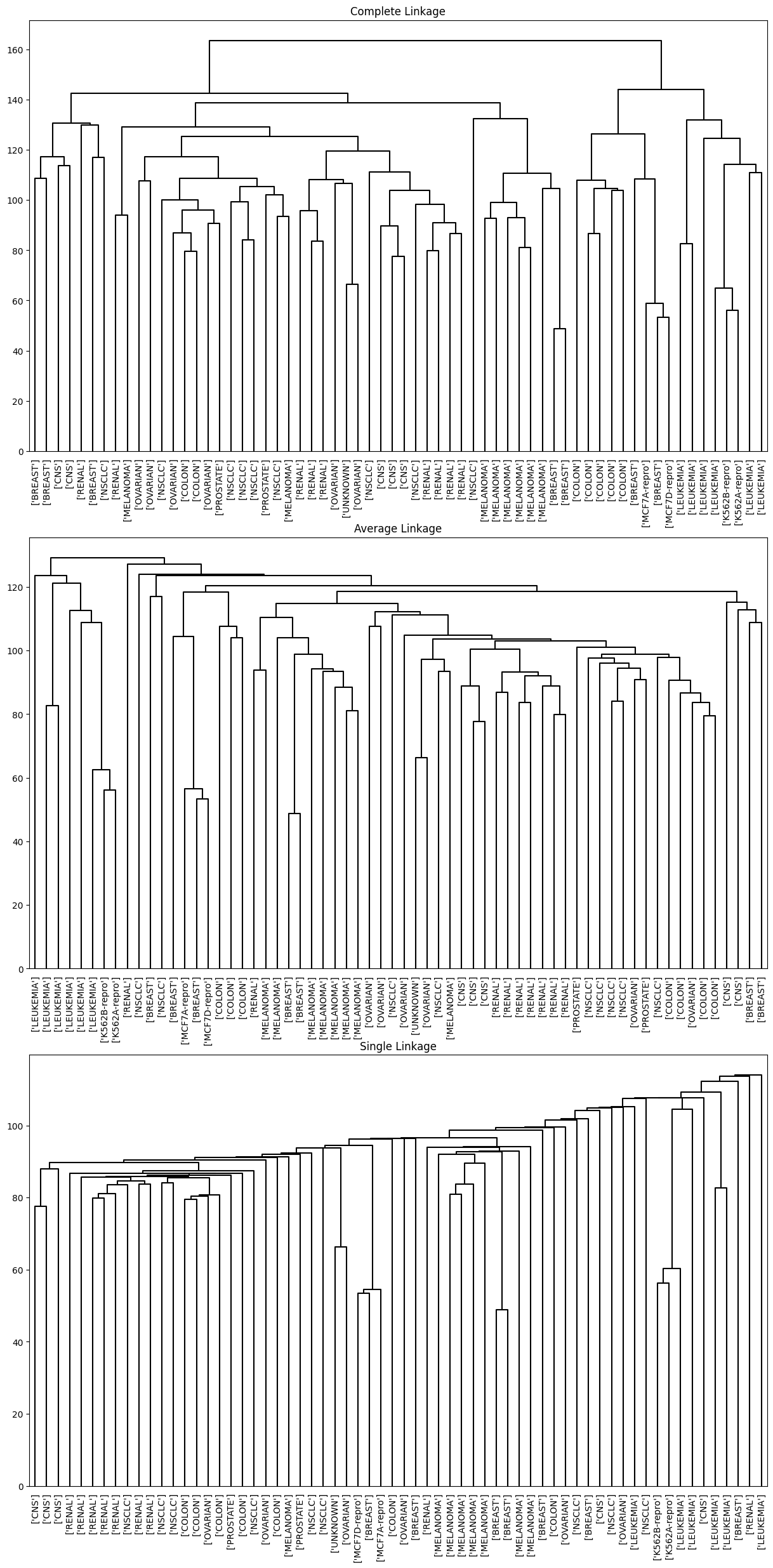
We see that the choice of linkage certainly does affect the results obtained. Typically, single linkage will tend to yield trailing clusters: very large clusters onto which individual observations attach one-by-one. On the other hand, complete and average linkage tend to yield more balanced, attractive clusters. For this reason, complete and average linkage are generally preferred to single linkage. Clearly cell lines within a single cancer type do tend to cluster together, although the clustering is not perfect. We will use complete linkage hierarchical clustering for the analysis that follows.
We can cut the dendrogram at the height that will yield a particular number of clusters, say four:
linkage_comp = compute_linkage(hc_comp)
comp_cut = cut_tree(linkage_comp, n_clusters=4).reshape(-1)
pd.crosstab(nci_labs['label'],
            pd.Series(comp_cut.reshape(-1), name='Complete'))
| Complete | 0 | 1 | 2 | 3 |
|---|---|---|---|---|
| label | ||||
| BREAST | 2 | 3 | 0 | 2 |
| CNS | 3 | 2 | 0 | 0 |
| COLON | 2 | 0 | 0 | 5 |
| K562A-repro | 0 | 0 | 1 | 0 |
| K562B-repro | 0 | 0 | 1 | 0 |
| LEUKEMIA | 0 | 0 | 6 | 0 |
| MCF7A-repro | 0 | 0 | 0 | 1 |
| MCF7D-repro | 0 | 0 | 0 | 1 |
| MELANOMA | 8 | 0 | 0 | 0 |
| NSCLC | 8 | 1 | 0 | 0 |
| OVARIAN | 6 | 0 | 0 | 0 |
| PROSTATE | 2 | 0 | 0 | 0 |
| RENAL | 8 | 1 | 0 | 0 |
| UNKNOWN | 1 | 0 | 0 | 0 |
There are some clear patterns. All the leukemia cell lines fall in one cluster, while the breast cancer cell lines are spread out over three different clusters.
We can plot a cut on the dendrogram that produces these four clusters:
fig, ax = plt.subplots(figsize=(10,10))
plot_nci('Complete', ax, cut=140)
ax.axhline(140, c='r', linewidth=4);
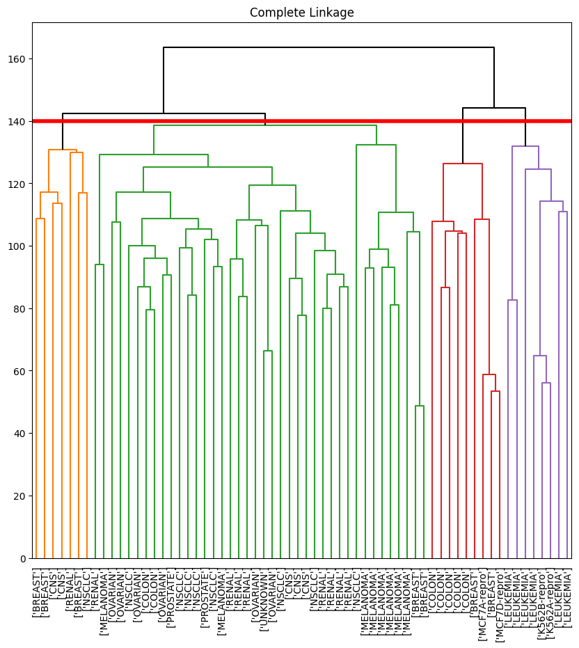
The axhline() function draws a horizontal line on top of any
existing set of axes. The argument 140 plots a horizontal
line at height 140 on the dendrogram; this is a height that
results in four distinct clusters. It is easy to verify that the
resulting clusters are the same as the ones we obtained in
comp_cut.
We claimed earlier in Section 12.4.2 that
\(K\)-means clustering and hierarchical clustering with the dendrogram
cut to obtain the same number of clusters can yield very different
results. How do these NCI60 hierarchical clustering results compare
to what we get if we perform \(K\)-means clustering with \(K=4\)?
nci_kmeans = KMeans(n_clusters=4,
                    random_state=0,
                    n_init=20).fit(nci_scaled)
pd.crosstab(pd.Series(comp_cut, name='HClust'),
            pd.Series(nci_kmeans.labels_, name='K-means'))
| K-means | 0 | 1 | 2 | 3 |
|---|---|---|---|---|
| HClust | ||||
| 0 | 1 | 20 | 10 | 9 |
| 1 | 0 | 7 | 0 | 0 |
| 2 | 8 | 0 | 0 | 0 |
| 3 | 0 | 0 | 9 | 0 |
We see that the four clusters obtained using hierarchical clustering and \(K\)-means clustering are somewhat different. First we note that the labels in the two clusterings are arbitrary. That is, swapping the identifier of the cluster does not change the clustering. We see here Cluster 3 in \(K\)-means clustering is identical to cluster 2 in hierarchical clustering. However, the other clusters differ: for instance, cluster 0 in \(K\)-means clustering contains a portion of the observations assigned to cluster 0 by hierarchical clustering, as well as all of the observations assigned to cluster 1 by hierarchical clustering.
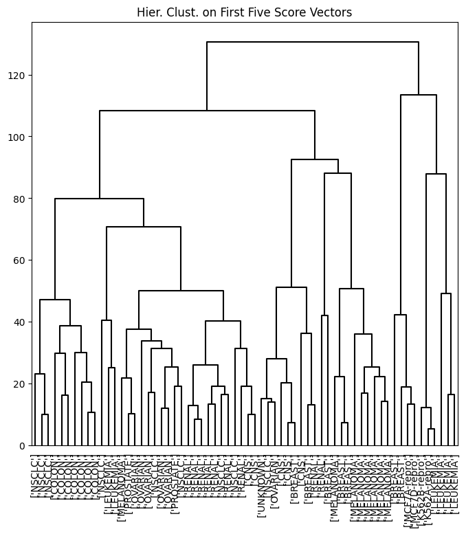
Rather than performing hierarchical clustering on the entire data matrix, we can also perform hierarchical clustering on the first few principal component score vectors, regarding these first few components as a less noisy version of the data.
hc_pca = HClust(n_clusters=None,
                distance_threshold=0,
                linkage='complete'
                ).fit(nci_scores[:,:5])
linkage_pca = compute_linkage(hc_pca)
fig, ax = plt.subplots(figsize=(8,8))
dendrogram(linkage_pca,
           labels=np.asarray(nci_labs),
           leaf_font_size=10,
           ax=ax,
           **cargs)
ax.set_title("Hier. Clust. on First Five Score Vectors")
pca_labels = pd.Series(cut_tree(linkage_pca,
                                n_clusters=4).reshape(-1),
                       name='Complete-PCA')
pd.crosstab(nci_labs['label'], pca_labels)
| Complete-PCA | 0 | 1 | 2 | 3 |
|---|---|---|---|---|
| label | ||||
| BREAST | 0 | 5 | 0 | 2 |
| CNS | 2 | 3 | 0 | 0 |
| COLON | 7 | 0 | 0 | 0 |
| K562A-repro | 0 | 0 | 1 | 0 |
| K562B-repro | 0 | 0 | 1 | 0 |
| LEUKEMIA | 2 | 0 | 4 | 0 |
| MCF7A-repro | 0 | 0 | 0 | 1 |
| MCF7D-repro | 0 | 0 | 0 | 1 |
| MELANOMA | 1 | 7 | 0 | 0 |
| NSCLC | 8 | 1 | 0 | 0 |
| OVARIAN | 5 | 1 | 0 | 0 |
| PROSTATE | 2 | 0 | 0 | 0 |
| RENAL | 7 | 2 | 0 | 0 |
| UNKNOWN | 0 | 1 | 0 | 0 |