Non-Linear Modeling#
![]()
In this lab, we demonstrate some of the nonlinear models discussed in
this chapter. We use the Wage data as a running example, and show that many of the complex non-linear fitting procedures discussed can easily be implemented in Python.
As usual, we start with some of our standard imports.
import numpy as np, pandas as pd
from matplotlib.pyplot import subplots
import statsmodels.api as sm
from ISLP import load_data
from ISLP.models import (summarize,
                         poly,
                         ModelSpec as MS)
from statsmodels.stats.anova import anova_lm
We again collect the new imports
needed for this lab. Many of these are developed specifically for the
ISLP package.
from pygam import (s as s_gam,
                   l as l_gam,
                   f as f_gam,
                   LinearGAM,
                   LogisticGAM)

from ISLP.transforms import (BSpline,
                             NaturalSpline)
from ISLP.models import bs, ns
from ISLP.pygam import (approx_lam,
                        degrees_of_freedom,
                        plot as plot_gam,
                        anova as anova_gam)
/Users/jonathantaylor/git-repos/ISLP/ISLP_labs/.venv/lib/python3.12/site-packages/ISLP/pygam.py:163: SyntaxWarning: invalid escape sequence '\l'
  $\lambda$ the trace of the smoother matrix, i.e.
Polynomial Regression and Step Functions#
We start by demonstrating how Figure 7.1 can be reproduced. Let’s begin by loading the data.
Wage = load_data('Wage')
y = Wage['wage']
age = Wage['age']
Throughout most of this lab, our response is Wage['wage'], which
we have stored as y above.
As in Section 3.6.6, we will use the poly() function to create a model matrix
that will fit a \(4\)th degree polynomial in age.
poly_age = MS([poly('age', degree=4)]).fit(Wage)
M = sm.OLS(y, poly_age.transform(Wage)).fit()
summarize(M)
| coef | std err | t | P>|t| | |
|---|---|---|---|---|
| intercept | 111.7036 | 0.729 | 153.283 | 0.000 |
| poly(age, degree=4)[0] | 447.0679 | 39.915 | 11.201 | 0.000 |
| poly(age, degree=4)[1] | -478.3158 | 39.915 | -11.983 | 0.000 |
| poly(age, degree=4)[2] | 125.5217 | 39.915 | 3.145 | 0.002 |
| poly(age, degree=4)[3] | -77.9112 | 39.915 | -1.952 | 0.051 |
This polynomial is constructed using the function poly(),
which creates
a special transformer Poly() (using sklearn terminology
for feature transformations such as PCA() seen in Section 6.5.3) which
allows for easy evaluation of the polynomial at new data points. Here poly() is referred to as a helper function, and sets up the transformation; Poly() is the actual workhorse that computes the transformation. See also
the
discussion of transformations on
page 118.
In the code above, the first line executes the fit() method
using the dataframe
Wage. This recomputes and stores as attributes any parameters needed by Poly()
on the training data, and these will be used on all subsequent
evaluations of the transform() method. For example, it is used
on the second line, as well as in the plotting function developed below.
We now create a grid of values for age at which we want
predictions.
age_grid = np.linspace(age.min(),
                       age.max(),
                       100)
age_df = pd.DataFrame({'age': age_grid})
Finally, we wish to plot the data and add the fit from the fourth-degree polynomial. As we will make
several similar plots below, we first write a function
to create all the ingredients and produce the plot. Our function
takes in a model specification (here a basis specified by a
transform), as well as a grid of age values. The function
produces a fitted curve as well as 95% confidence bands. By using
an argument for basis we can produce and plot the results with several different
transforms, such as the splines we will see shortly.
def plot_wage_fit(age_df,
                  basis,
                  title):

    X = basis.transform(Wage)
    Xnew = basis.transform(age_df)
    M = sm.OLS(y, X).fit()
    preds = M.get_prediction(Xnew)
    bands = preds.conf_int(alpha=0.05)
    fig, ax = subplots(figsize=(8,8))
    ax.scatter(age,
               y,
               facecolor='gray',
               alpha=0.5)
    for val, ls in zip([preds.predicted_mean,
                      bands[:,0],
                      bands[:,1]],
                     ['b','r--','r--']):
        ax.plot(age_df.values, val, ls, linewidth=3)
    ax.set_title(title, fontsize=20)
    ax.set_xlabel('Age', fontsize=20)
    ax.set_ylabel('Wage', fontsize=20);
    return ax
We include an argument alpha to ax.scatter()
to add some transparency to the points. This provides a visual indication
of density. Notice the use of the zip() function in the
for loop above (see Section 2.3.8).
We have three lines to plot, each with different colors and line
types. Here zip() conveniently bundles these together as
iterators in the loop. {In Python{} speak, an “iterator” is an object with a finite number of values, that can be iterated on, as in a loop.}
We now plot the fit of the fourth-degree polynomial using this function.
plot_wage_fit(age_df,
              poly_age,
              'Degree-4 Polynomial');

With polynomial regression we must decide on the degree of
the polynomial to use. Sometimes we just wing it, and decide to use
second or third degree polynomials, simply to obtain a nonlinear fit. But we can
make such a decision in a more systematic way. One way to do this is through hypothesis
tests, which we demonstrate here. We now fit a series of models ranging from
linear (degree-one) to degree-five polynomials,
and look to determine the simplest model that is sufficient to
explain the relationship between wage and age. We use the
anova_lm() function, which performs a series of ANOVA
tests.
An \emph{analysis of
variance} or ANOVA tests the null
hypothesis that a model \(\mathcal{M}_1\) is sufficient to explain the
data against the alternative hypothesis that a more complex model
\(\mathcal{M}_2\) is required. The determination is based on an F-test.
To perform the test, the models \(\mathcal{M}_1\) and \(\mathcal{M}_2\) must be nested:
the space spanned by the predictors in \(\mathcal{M}_1\) must be a subspace of the
space spanned by the predictors in \(\mathcal{M}_2\). In this case, we
fit five different polynomial
models and sequentially compare the simpler model to the more complex
model.
models = [MS([poly('age', degree=d)])
          for d in range(1, 6)]
Xs = [model.fit_transform(Wage) for model in models]
anova_lm(*[sm.OLS(y, X_).fit()
           for X_ in Xs])
| df_resid | ssr | df_diff | ss_diff | F | Pr(>F) | |
|---|---|---|---|---|---|---|
| 0 | 2998.0 | 5.022216e+06 | 0.0 | NaN | NaN | NaN |
| 1 | 2997.0 | 4.793430e+06 | 1.0 | 228786.010128 | 143.593107 | 2.363850e-32 |
| 2 | 2996.0 | 4.777674e+06 | 1.0 | 15755.693664 | 9.888756 | 1.679202e-03 |
| 3 | 2995.0 | 4.771604e+06 | 1.0 | 6070.152124 | 3.809813 | 5.104620e-02 |
| 4 | 2994.0 | 4.770322e+06 | 1.0 | 1282.563017 | 0.804976 | 3.696820e-01 |
Notice the * in the anova_lm() line above. This
function takes a variable number of non-keyword arguments, in this case fitted models.
When these models are provided as a list (as is done here), it must be
prefixed by *.
The p-value comparing the linear models[0] to the quadratic
models[1] is essentially zero, indicating that a linear
fit is not sufficient. {Indexing starting at zero is confusing for the polynomial degree example, since models[1] is quadratic rather than linear!} Similarly the p-value comparing the quadratic
models[1] to the cubic models[2] is very low (0.0017), so the
quadratic fit is also insufficient. The p-value comparing the cubic
and degree-four polynomials, models[2] and models[3], is
approximately 5%, while the degree-five polynomial models[4] seems
unnecessary because its p-value is 0.37. Hence, either a cubic or a
quartic polynomial appear to provide a reasonable fit to the data, but
lower- or higher-order models are not justified.
In this case, instead of using the anova() function, we could
have obtained these p-values more succinctly by exploiting the fact
that poly() creates orthogonal polynomials.
summarize(M)
| coef | std err | t | P>|t| | |
|---|---|---|---|---|
| intercept | 111.7036 | 0.729 | 153.283 | 0.000 |
| poly(age, degree=4)[0] | 447.0679 | 39.915 | 11.201 | 0.000 |
| poly(age, degree=4)[1] | -478.3158 | 39.915 | -11.983 | 0.000 |
| poly(age, degree=4)[2] | 125.5217 | 39.915 | 3.145 | 0.002 |
| poly(age, degree=4)[3] | -77.9112 | 39.915 | -1.952 | 0.051 |
Notice that the p-values are the same, and in fact the square of
the t-statistics are equal to the F-statistics from the
anova_lm() function; for example:
(-11.983)**2
143.59228900000002
However, the ANOVA method works whether or not we used orthogonal
polynomials, provided the models are nested. For example, we can use
anova_lm() to compare the following three
models, which all have a linear term in education and a
polynomial in age of different degrees:
models = [MS(['education', poly('age', degree=d)])
          for d in range(1, 4)]
XEs = [model.fit_transform(Wage)
       for model in models]
anova_lm(*[sm.OLS(y, X_).fit() for X_ in XEs])
| df_resid | ssr | df_diff | ss_diff | F | Pr(>F) | |
|---|---|---|---|---|---|---|
| 0 | 2997.0 | 3.902335e+06 | 0.0 | NaN | NaN | NaN |
| 1 | 2996.0 | 3.759472e+06 | 1.0 | 142862.701185 | 113.991883 | 3.838075e-26 |
| 2 | 2995.0 | 3.753546e+06 | 1.0 | 5926.207070 | 4.728593 | 2.974318e-02 |
As an alternative to using hypothesis tests and ANOVA, we could choose the polynomial degree using cross-validation, as discussed in Chapter 5.
Next we consider the task of predicting whether an individual earns
more than $250,000 per year. We proceed much as before, except
that first we create the appropriate response vector, and then apply
the glm() function using the binomial family in order
to fit a polynomial logistic regression model.
X = poly_age.transform(Wage)
high_earn = Wage['high_earn'] = y > 250 # shorthand
glm = sm.GLM(y > 250,
             X,
             family=sm.families.Binomial())
B = glm.fit()
summarize(B)
| coef | std err | z | P>|z| | |
|---|---|---|---|---|
| intercept | -4.3012 | 0.345 | -12.457 | 0.000 |
| poly(age, degree=4)[0] | 71.9642 | 26.133 | 2.754 | 0.006 |
| poly(age, degree=4)[1] | -85.7729 | 35.929 | -2.387 | 0.017 |
| poly(age, degree=4)[2] | 34.1626 | 19.697 | 1.734 | 0.083 |
| poly(age, degree=4)[3] | -47.4008 | 24.105 | -1.966 | 0.049 |
Once again, we make predictions using the get_prediction() method.
newX = poly_age.transform(age_df)
preds = B.get_prediction(newX)
bands = preds.conf_int(alpha=0.05)
We now plot the estimated relationship.
fig, ax = subplots(figsize=(8,8))
rng = np.random.default_rng(0)
ax.scatter(age +
           0.2 * rng.uniform(size=y.shape[0]),
           np.where(high_earn, 0.198, 0.002),
           fc='gray',
           marker='|')
for val, ls in zip([preds.predicted_mean,
                  bands[:,0],
                  bands[:,1]],
                 ['b','r--','r--']):
    ax.plot(age_df.values, val, ls, linewidth=3)
ax.set_title('Degree-4 Polynomial', fontsize=20)
ax.set_xlabel('Age', fontsize=20)
ax.set_ylim([0,0.2])
ax.set_ylabel('P(Wage > 250)', fontsize=20);
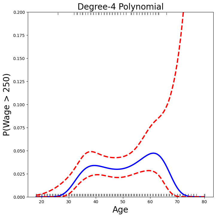
We have drawn the age values corresponding to the observations with
wage values above 250 as gray marks on the top of the plot, and
those with wage values below 250 are shown as gray marks on the
bottom of the plot. We added a small amount of noise to jitter
the age values a bit so that observations with the same age
value do not cover each other up. This type of plot is often called a
rug plot.
In order to fit a step function, as discussed in
Section 7.2, we first use the pd.qcut()
function to discretize age based on quantiles. Then we use pd.get_dummies() to create the
columns of the model matrix for this categorical variable. Note that this function will
include all columns for a given categorical, rather than the usual approach which drops one
of the levels.
cut_age = pd.qcut(age, 4)
summarize(sm.OLS(y, pd.get_dummies(cut_age)).fit())
| coef | std err | t | P>|t| | |
|---|---|---|---|---|
| (17.999, 33.75] | 94.1584 | 1.478 | 63.692 | 0.0 |
| (33.75, 42.0] | 116.6608 | 1.470 | 79.385 | 0.0 |
| (42.0, 51.0] | 119.1887 | 1.416 | 84.147 | 0.0 |
| (51.0, 80.0] | 116.5717 | 1.559 | 74.751 | 0.0 |
Here pd.qcut() automatically picked the cutpoints based on the quantiles 25%, 50% and 75%, which results in four regions. We could also have specified our own
quantiles directly instead of the argument 4. For cuts not based
on quantiles we would use the pd.cut() function.
The function pd.qcut() (and pd.cut()) returns an ordered categorical variable.
The regression model then creates a set of
dummy variables for use in the regression. Since age is the only variable in the model, the value $94,158.40 is the average salary for those under 33.75 years of
age, and the other coefficients are the average
salary for those in the other age groups. We can produce
predictions and plots just as we did in the case of the polynomial
fit.
Splines#
In order to fit regression splines, we use transforms
from the ISLP package. The actual spline
evaluation functions are in the scipy.interpolate package;
we have simply wrapped them as transforms
similar to Poly() and PCA().
In Section 7.4, we saw
that regression splines can be fit by constructing an appropriate
matrix of basis functions. The BSpline() function generates the
entire matrix of basis functions for splines with the specified set of
knots. By default, the B-splines produced are cubic. To change the degree, use
the argument degree.
bs_ = BSpline(internal_knots=[25,40,60], intercept=True).fit(age)
bs_age = bs_.transform(age)
bs_age.shape
(3000, 7)
This results in a seven-column matrix, which is what is expected for a cubic-spline basis with 3 interior knots.
We can form this same matrix using the bs() object,
which facilitates adding this to a model-matrix builder (as in poly() versus its workhorse Poly()) described in Section 7.8.1.
We now fit a cubic spline model to the Wage data.
bs_age = MS([bs('age', internal_knots=[25,40,60])])
Xbs = bs_age.fit_transform(Wage)
M = sm.OLS(y, Xbs).fit()
summarize(M)
| coef | std err | t | P>|t| | |
|---|---|---|---|---|
| intercept | 60.4937 | 9.460 | 6.394 | 0.000 |
| bs(age, internal_knots=[25, 40, 60])[0] | 3.9805 | 12.538 | 0.317 | 0.751 |
| bs(age, internal_knots=[25, 40, 60])[1] | 44.6310 | 9.626 | 4.636 | 0.000 |
| bs(age, internal_knots=[25, 40, 60])[2] | 62.8388 | 10.755 | 5.843 | 0.000 |
| bs(age, internal_knots=[25, 40, 60])[3] | 55.9908 | 10.706 | 5.230 | 0.000 |
| bs(age, internal_knots=[25, 40, 60])[4] | 50.6881 | 14.402 | 3.520 | 0.000 |
| bs(age, internal_knots=[25, 40, 60])[5] | 16.6061 | 19.126 | 0.868 | 0.385 |
The column names are a little cumbersome, and have caused us to truncate the printed summary. They can be set on construction using the name argument as follows.
bs_age = MS([bs('age',
                internal_knots=[25,40,60],
                name='bs(age)')])
Xbs = bs_age.fit_transform(Wage)
M = sm.OLS(y, Xbs).fit()
summarize(M)
| coef | std err | t | P>|t| | |
|---|---|---|---|---|
| intercept | 60.4937 | 9.460 | 6.394 | 0.000 |
| bs(age)[0] | 3.9805 | 12.538 | 0.317 | 0.751 |
| bs(age)[1] | 44.6310 | 9.626 | 4.636 | 0.000 |
| bs(age)[2] | 62.8388 | 10.755 | 5.843 | 0.000 |
| bs(age)[3] | 55.9908 | 10.706 | 5.230 | 0.000 |
| bs(age)[4] | 50.6881 | 14.402 | 3.520 | 0.000 |
| bs(age)[5] | 16.6061 | 19.126 | 0.868 | 0.385 |
Notice that there are 6 spline coefficients rather than 7. This is because, by default,
bs() assumes intercept=False, since we typically have an overall intercept in the model.
So it generates the spline basis with the given knots, and then discards one of the basis functions to account for the intercept.
We could also use the df (degrees of freedom) option to
specify the complexity of the spline. We see above that with 3 knots,
the spline basis has 6 columns or degrees of freedom. When we specify
df=6 rather than the actual knots, bs() will produce a
spline with 3 knots chosen at uniform quantiles of the training data.
We can see these chosen knots most easily using Bspline() directly:
BSpline(df=6).fit(age).internal_knots_
array([33.75, 42. , 51. ])
When asking for six degrees of freedom,
the transform chooses knots at ages 33.75, 42.0, and 51.0,
which correspond to the 25th, 50th, and 75th percentiles of
age.
When using B-splines we need not limit ourselves to cubic polynomials
(i.e. degree=3). For instance, using degree=0 results
in piecewise constant functions, as in our example with
pd.qcut() above.
bs_age0 = MS([bs('age',
                 df=3,
                 degree=0)]).fit(Wage)
Xbs0 = bs_age0.transform(Wage)
summarize(sm.OLS(y, Xbs0).fit())
| coef | std err | t | P>|t| | |
|---|---|---|---|---|
| intercept | 94.1584 | 1.478 | 63.687 | 0.0 |
| bs(age, df=3, degree=0)[0] | 22.3490 | 2.152 | 10.388 | 0.0 |
| bs(age, df=3, degree=0)[1] | 24.8076 | 2.044 | 12.137 | 0.0 |
| bs(age, df=3, degree=0)[2] | 22.7814 | 2.087 | 10.917 | 0.0 |
This fit should be compared with cell [15] where we use qcut()
to create four bins by cutting at the 25%, 50% and 75% quantiles of
age. Since we specified df=3 for degree-zero splines here, there will also be
knots at the same three quantiles. Although the coefficients appear different, we
see that this is a result of the different coding. For example, the
first coefficient is identical in both cases, and is the mean response
in the first bin. For the second coefficient, we have
\(94.158 + 22.349 = 116.507 \approx 116.611\), the latter being the mean
in the second bin in cell [15]. Here the intercept is coded by a column
of ones, so the second, third and fourth coefficients are increments
for those bins. Why is the sum not exactly the same? It turns out that
the qcut() uses \(\leq\), while bs() uses \(<\) when
deciding bin membership.
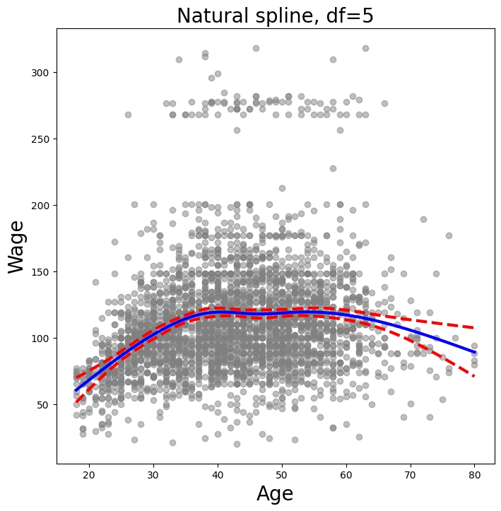
In order to fit a natural spline, we use the NaturalSpline()
transform with the corresponding helper ns(). Here we fit a natural spline with five
degrees of freedom (excluding the intercept) and plot the results.
ns_age = MS([ns('age', df=5)]).fit(Wage)
M_ns = sm.OLS(y, ns_age.transform(Wage)).fit()
summarize(M_ns)
| coef | std err | t | P>|t| | |
|---|---|---|---|---|
| intercept | 60.4752 | 4.708 | 12.844 | 0.000 |
| ns(age, df=5)[0] | 61.5267 | 4.709 | 13.065 | 0.000 |
| ns(age, df=5)[1] | 55.6912 | 5.717 | 9.741 | 0.000 |
| ns(age, df=5)[2] | 46.8184 | 4.948 | 9.463 | 0.000 |
| ns(age, df=5)[3] | 83.2036 | 11.918 | 6.982 | 0.000 |
| ns(age, df=5)[4] | 6.8770 | 9.484 | 0.725 | 0.468 |
We now plot the natural spline using our plotting function.
plot_wage_fit(age_df,
              ns_age,
              'Natural spline, df=5');
Smoothing Splines and GAMs#
A smoothing spline is a special case of a GAM with squared-error loss
and a single feature. To fit GAMs in Python we will use the
pygam package which can be installed via pip install pygam. The
estimator LinearGAM() uses squared-error loss.
The GAM is specified by associating each column
of a model matrix with a particular smoothing operation:
s for smoothing spline; l for linear, and f for factor or categorical variables.
The argument 0 passed to s below indicates that this smoother will
apply to the first column of a feature matrix. Below, we pass it a
matrix with a single column: X_age. The argument lam is the penalty parameter \(\lambda\) as discussed in Section 7.5.2.
X_age = np.asarray(age).reshape((-1,1))
gam = LinearGAM(s_gam(0, lam=0.6))
gam.fit(X_age, y)
LinearGAM(callbacks=[Deviance(), Diffs()], fit_intercept=True,
   max_iter=100, scale=None, terms=s(0) + intercept, tol=0.0001,
   verbose=False)
The pygam library generally expects a matrix of features so we reshape age to be a matrix (a two-dimensional array) instead
of a vector (i.e. a one-dimensional array). The -1 in the call to the reshape() method tells numpy to impute the
size of that dimension based on the remaining entries of the shape tuple.
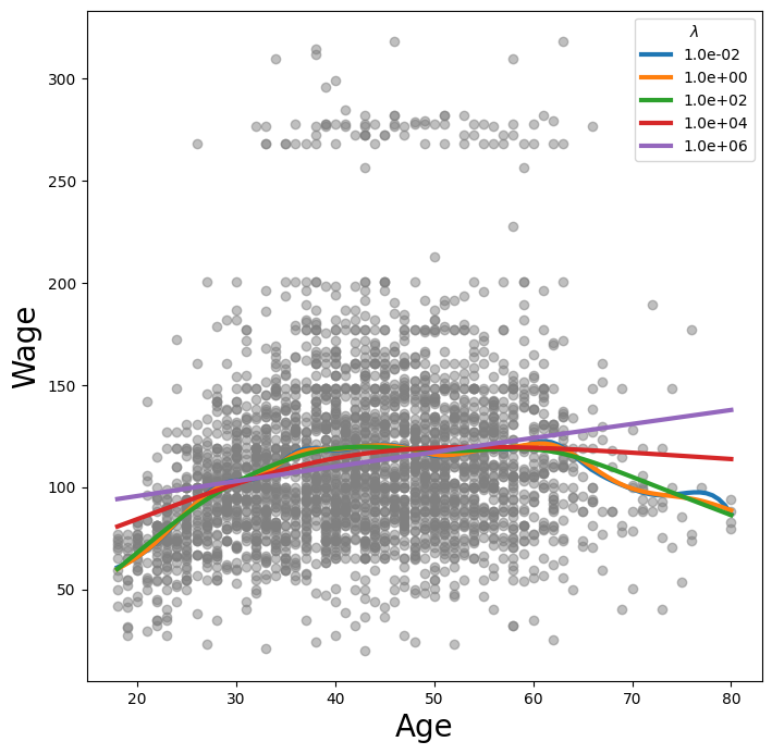
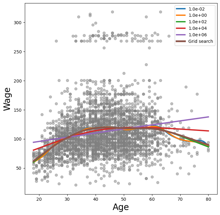
Let’s investigate how the fit changes with the smoothing parameter lam.
The function np.logspace() is similar to np.linspace() but spaces points
evenly on the log-scale. Below we vary lam from \(10^{-2}\) to \(10^6\).
fig, ax = subplots(figsize=(8,8))
ax.scatter(age, y, facecolor='gray', alpha=0.5)
for lam in np.logspace(-2, 6, 5):
    gam = LinearGAM(s_gam(0, lam=lam)).fit(X_age, y)
    ax.plot(age_grid,
            gam.predict(age_grid),
            label='{:.1e}'.format(lam),
            linewidth=3)
ax.set_xlabel('Age', fontsize=20)
ax.set_ylabel('Wage', fontsize=20);
ax.legend(title='$\lambda$');
<>:11: SyntaxWarning: invalid escape sequence '\l'
<>:11: SyntaxWarning: invalid escape sequence '\l'
/var/folders/16/8y65_zv174qgdp4ktlmpv12h0000gq/T/ipykernel_26054/1121239147.py:11: SyntaxWarning: invalid escape sequence '\l'
  ax.legend(title='$\lambda$');
The pygam package can perform a search for an optimal smoothing parameter.
gam_opt = gam.gridsearch(X_age, y)
ax.plot(age_grid,
        gam_opt.predict(age_grid),
        label='Grid search',
        linewidth=4)
ax.legend()
fig
0% (0 of 11) | | Elapsed Time: 0:00:00 ETA: --:--:--
45% (5 of 11) |########### | Elapsed Time: 0:00:00 ETA: 0:00:00
81% (9 of 11) |#################### | Elapsed Time: 0:00:00 ETA: 0:00:00
100% (11 of 11) |########################| Elapsed Time: 0:00:00 Time: 0:00:00
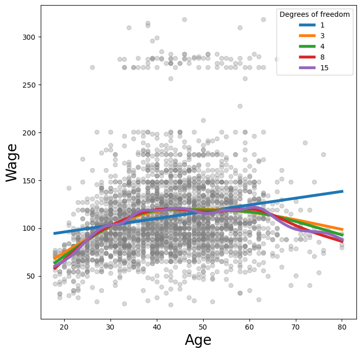
Alternatively, we can fix the degrees of freedom of the smoothing
spline using a function included in the ISLP.pygam package. Below we
find a value of \(\lambda\) that gives us roughly four degrees of
freedom. We note here that these degrees of freedom include the
unpenalized intercept and linear term of the smoothing spline, hence there are at least two
degrees of freedom.
age_term = gam.terms[0]
lam_4 = approx_lam(X_age, age_term, 4)
age_term.lam = lam_4
degrees_of_freedom(X_age, age_term)
np.float64(4.00000010000165)
Let’s vary the degrees of freedom in a similar plot to above. We choose the degrees of freedom
as the desired degrees of freedom plus one to account for the fact that these smoothing
splines always have an intercept term. Hence, a value of one for df is just a linear fit.
fig, ax = subplots(figsize=(8,8))
ax.scatter(X_age,
           y,
           facecolor='gray',
           alpha=0.3)
for df in [1,3,4,8,15]:
    lam = approx_lam(X_age, age_term, df+1)
    age_term.lam = lam
    gam.fit(X_age, y)
    ax.plot(age_grid,
            gam.predict(age_grid),
            label='{:d}'.format(df),
            linewidth=4)
ax.set_xlabel('Age', fontsize=20)
ax.set_ylabel('Wage', fontsize=20);
ax.legend(title='Degrees of freedom');
Additive Models with Several Terms#
The strength of generalized additive models lies in their ability to fit multivariate regression models with more flexibility than linear models. We demonstrate two approaches: the first in a more manual fashion using natural splines and piecewise constant functions, and the second using the pygam package and smoothing splines.
We now fit a GAM by hand to predict
wage using natural spline functions of year and age,
treating education as a qualitative predictor, as in (7.16).
Since this is just a big linear regression model
using an appropriate choice of basis functions, we can simply do this
using the sm.OLS() function.
We will build the model matrix in a more manual fashion here, since we wish to access the pieces separately when constructing partial dependence plots.
ns_age = NaturalSpline(df=4).fit(age)
ns_year = NaturalSpline(df=5).fit(Wage['year'])
Xs = [ns_age.transform(age),
      ns_year.transform(Wage['year']),
      pd.get_dummies(Wage['education']).values]
X_bh = np.hstack(Xs)
gam_bh = sm.OLS(y, X_bh).fit()
Here the function NaturalSpline() is the workhorse supporting
the ns() helper function. We chose to use all columns of the
indicator matrix for the categorical variable education, making an intercept redundant.
Finally, we stacked the three component matrices horizontally to form the model matrix X_bh.
We now show how to construct partial dependence plots for each of the terms in our rudimentary GAM. We can do this by hand,
given grids for age and year.
We simply predict with new \(X\) matrices, fixing all but one of the features at a time.
age_grid = np.linspace(age.min(),
                       age.max(),
                       100)
X_age_bh = X_bh.copy()[:100]
X_age_bh[:] = X_bh[:].mean(0)[None,:]
X_age_bh[:,:4] = ns_age.transform(age_grid)
preds = gam_bh.get_prediction(X_age_bh)
bounds_age = preds.conf_int(alpha=0.05)
partial_age = preds.predicted_mean
center = partial_age.mean()
partial_age -= center
bounds_age -= center
fig, ax = subplots(figsize=(8,8))
ax.plot(age_grid, partial_age, 'b', linewidth=3)
ax.plot(age_grid, bounds_age[:,0], 'r--', linewidth=3)
ax.plot(age_grid, bounds_age[:,1], 'r--', linewidth=3)
ax.set_xlabel('Age')
ax.set_ylabel('Effect on wage')
ax.set_title('Partial dependence of age on wage', fontsize=20);
Let’s explain in some detail what we did above. The idea is to create a new prediction matrix, where all but the columns belonging to age are constant (and set to their training-data means). The four columns for age are filled in with the natural spline basis evaluated at the 100 values in age_grid.
We made a grid of length 100 in
age, and created a matrixX_age_bhwith 100 rows and the same number of columns asX_bh.We replaced every row of this matrix with the column means of the original.
We then replace just the first four columns representing
agewith the natural spline basis computed at the values inage_grid.
The remaining steps should by now be familiar.
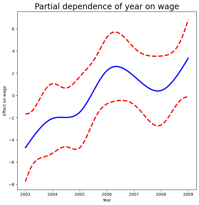
We also look at the effect of year on wage; the process is the same.
year_grid = np.linspace(2003, 2009, 100)
year_grid = np.linspace(Wage['year'].min(),
                        Wage['year'].max(),
                        100)
X_year_bh = X_bh.copy()[:100]
X_year_bh[:] = X_bh[:].mean(0)[None,:]
X_year_bh[:,4:9] = ns_year.transform(year_grid)
preds = gam_bh.get_prediction(X_year_bh)
bounds_year = preds.conf_int(alpha=0.05)
partial_year = preds.predicted_mean
center = partial_year.mean()
partial_year -= center
bounds_year -= center
fig, ax = subplots(figsize=(8,8))
ax.plot(year_grid, partial_year, 'b', linewidth=3)
ax.plot(year_grid, bounds_year[:,0], 'r--', linewidth=3)
ax.plot(year_grid, bounds_year[:,1], 'r--', linewidth=3)
ax.set_xlabel('Year')
ax.set_ylabel('Effect on wage')
ax.set_title('Partial dependence of year on wage', fontsize=20);
We now fit the model (7.16) using smoothing splines rather
than natural splines. All of the
terms in (7.16) are fit simultaneously, taking each other
into account to explain the response. The pygam package only works with matrices, so we must convert
the categorical series education to its array representation, which can be found
with the cat.codes attribute of education. As year only has 7 unique values, we
use only seven basis functions for it.
gam_full = LinearGAM(s_gam(0) +
                     s_gam(1, n_splines=7) +
                     f_gam(2, lam=0))
Xgam = np.column_stack([age,
                        Wage['year'],
                        Wage['education'].cat.codes])
gam_full = gam_full.fit(Xgam, y)
The two s_gam() terms result in smoothing spline fits, and use a default value for \(\lambda\) (lam=0.6), which is somewhat arbitrary. For the categorical term education, specified using a f_gam() term, we specify lam=0 to avoid any shrinkage.
We produce the partial dependence plot in age to see the effect of these choices.
The values for the plot
are generated by the pygam package. We provide a plot_gam()
function for partial-dependence plots in ISLP.pygam, which makes this job easier than in our last example with natural splines.
fig, ax = subplots(figsize=(8,8))
plot_gam(gam_full, 0, ax=ax)
ax.set_xlabel('Age')
ax.set_ylabel('Effect on wage')
ax.set_title('Partial dependence of age on wage - default lam=0.6', fontsize=20);
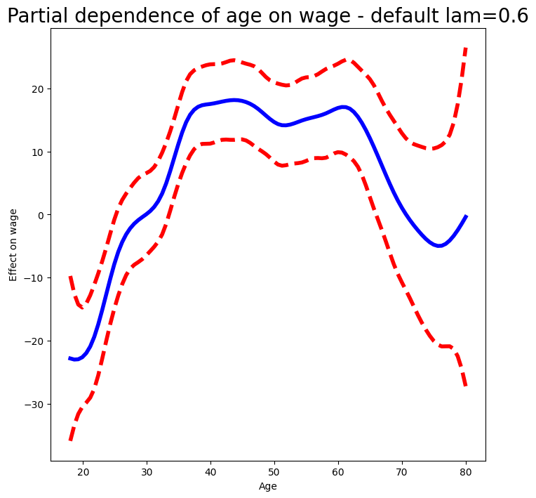
We see that the function is somewhat wiggly. It is more natural to specify the df than a value for lam.
We refit a GAM using four degrees of freedom each for
age and year. Recall that the addition of one below takes into account the intercept
of the smoothing spline.
age_term = gam_full.terms[0]
age_term.lam = approx_lam(Xgam, age_term, df=4+1)
year_term = gam_full.terms[1]
year_term.lam = approx_lam(Xgam, year_term, df=4+1)
gam_full = gam_full.fit(Xgam, y)
Note that updating age_term.lam above updates it in gam_full.terms[0] as well! Likewise for year_term.lam.
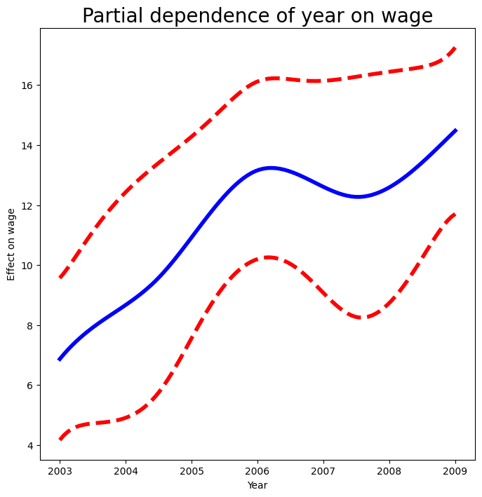
Repeating the plot for age, we see that it is much smoother.
We also produce the plot for year.
fig, ax = subplots(figsize=(8,8))
plot_gam(gam_full,
         1,
         ax=ax)
ax.set_xlabel('Year')
ax.set_ylabel('Effect on wage')
ax.set_title('Partial dependence of year on wage', fontsize=20)
Text(0.5, 1.0, 'Partial dependence of year on wage')
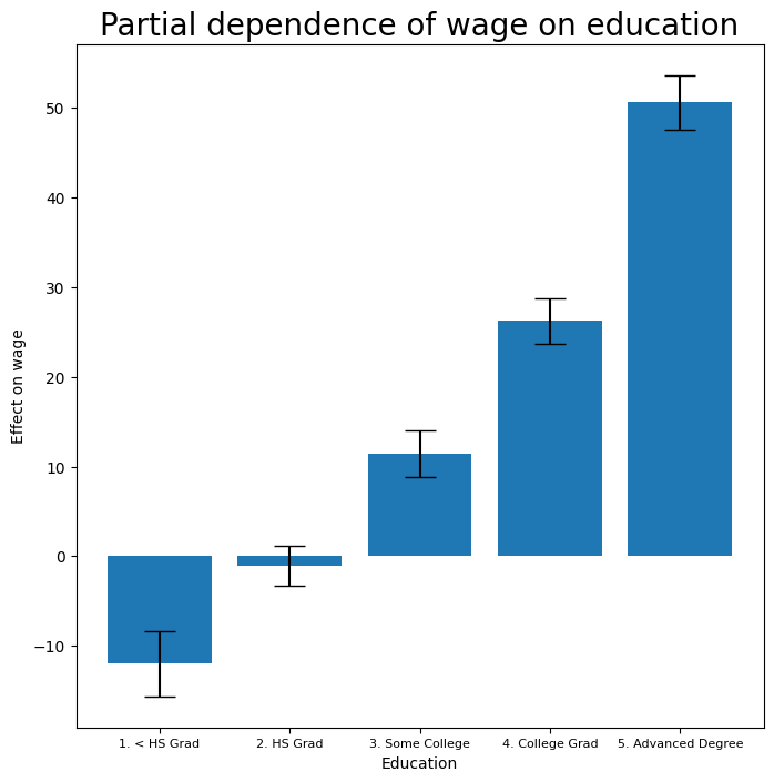
Finally we plot education, which is categorical. The partial dependence plot is different, and more suitable for the set of fitted constants for each level of this variable.
fig, ax = subplots(figsize=(8, 8))
ax = plot_gam(gam_full, 2)
ax.set_xlabel('Education')
ax.set_ylabel('Effect on wage')
ax.set_title('Partial dependence of wage on education',
             fontsize=20);
ax.set_xticklabels(Wage['education'].cat.categories, fontsize=8);
ANOVA Tests for Additive Models#
In all of our models, the function of year looks rather linear. We can
perform a series of ANOVA tests in order to determine which of these
three models is best: a GAM that excludes year (\(\mathcal{M}_1\)),
a GAM that uses a linear function of year (\(\mathcal{M}_2\)), or a
GAM that uses a spline function of year (\(\mathcal{M}_3\)).
gam_0 = LinearGAM(age_term + f_gam(2, lam=0))
gam_0.fit(Xgam, y)
gam_linear = LinearGAM(age_term +
                       l_gam(1, lam=0) +
                       f_gam(2, lam=0))
gam_linear.fit(Xgam, y)
LinearGAM(callbacks=[Deviance(), Diffs()], fit_intercept=True,
   max_iter=100, scale=None, terms=s(0) + l(1) + f(2) + intercept,
   tol=0.0001, verbose=False)
Notice our use of age_term in the expressions above. We do this because
earlier we set the value for lam in this term to achieve four degrees of freedom.
To directly assess the effect of year we run an ANOVA on the
three models fit above.
anova_gam(gam_0, gam_linear, gam_full)
| deviance | df | deviance_diff | df_diff | F | pvalue | |
|---|---|---|---|---|---|---|
| 0 | 105402.432206 | 2991.004005 | NaN | NaN | NaN | NaN |
| 1 | 105134.624170 | 2990.005190 | 267.808037 | 0.998815 | 7.625329 | 0.016210 |
| 2 | 105030.684668 | 2987.007254 | 103.939502 | 2.997936 | 0.986003 | 0.429637 |
We find that there is compelling evidence that a GAM with a linear
function in year is better than a GAM that does not include
year at all (\(p\)-value= 0.002). However, there is no
evidence that a non-linear function of year is needed
(\(p\)-value=0.435). In other words, based on the results of this
ANOVA, \(\mathcal{M}_2\) is preferred.
We can repeat the same process for age as well. We see there is very clear evidence that
a non-linear term is required for age.
gam_0 = LinearGAM(year_term +
                  f_gam(2, lam=0))
gam_linear = LinearGAM(l_gam(0, lam=0) +
                       year_term +
                       f_gam(2, lam=0))
gam_0.fit(Xgam, y)
gam_linear.fit(Xgam, y)
anova_gam(gam_0, gam_linear, gam_full)
| deviance | df | deviance_diff | df_diff | F | pvalue | |
|---|---|---|---|---|---|---|
| 0 | 109043.809955 | 2991.000589 | NaN | NaN | NaN | NaN |
| 1 | 107295.111571 | 2990.000704 | 1748.698385 | 0.999884 | 49.737638 | 0.000009 |
| 2 | 105030.684668 | 2987.007254 | 2264.426903 | 2.993450 | 21.513266 | 0.000026 |
There is a (verbose) summary() method for the GAM fit.
gam_full.summary()
LinearGAM
=============================================== ==========================================================
Distribution:                        NormalDist Effective DoF:                                     12.9927
Link Function:                     IdentityLink Log Likelihood:                                 -14930.261
Number of Samples:                         3000 AIC:                                            29888.5074
                                                AICc:                                            29888.648
                                                GCV:                                             1246.1129
                                                Scale:                                             35.1625
                                                Pseudo R-Squared:                                   0.2928
==========================================================================================================
Feature Function                  Lambda               Rank         EDoF         P > x        Sig. Code
================================= ==================== ============ ============ ============ ============
s(0)                              [465.0491]           20           5.1          1.11e-16     ***
s(1)                              [2.1564]             7            4.0          8.10e-03     **
f(2)                              [0]                  5            4.0          1.11e-16     ***
intercept                                              1            0.0          1.11e-16     ***
==========================================================================================================
Significance codes:  0 '***' 0.001 '**' 0.01 '*' 0.05 '.' 0.1 ' ' 1

WARNING: Fitting splines and a linear function to a feature introduces a model identifiability problem
         which can cause p-values to appear significant when they are not.

WARNING: p-values calculated in this manner behave correctly for un-penalized models or models with
         known smoothing parameters, but when smoothing parameters have been estimated, the p-values
         are typically lower than they should be, meaning that the tests reject the null too readily.
/var/folders/16/8y65_zv174qgdp4ktlmpv12h0000gq/T/ipykernel_26054/2135516388.py:1: UserWarning: KNOWN BUG: p-values computed in this summary are likely much smaller than they should be.

Please do not make inferences based on these values!

Collaborate on a solution, and stay up to date at:
github.com/dswah/pyGAM/issues/163

  gam_full.summary()
We can make predictions from gam objects, just like from
lm objects, using the predict() method for the class
gam. Here we make predictions on the training set.
Yhat = gam_full.predict(Xgam)
In order to fit a logistic regression GAM, we use LogisticGAM()
from pygam.
gam_logit = LogisticGAM(age_term +
                        l_gam(1, lam=0) +
                        f_gam(2, lam=0))
gam_logit.fit(Xgam, high_earn)
LogisticGAM(callbacks=[Deviance(), Diffs(), Accuracy()],
   fit_intercept=True, max_iter=100,
   terms=s(0) + l(1) + f(2) + intercept, tol=0.0001, verbose=False)
fig, ax = subplots(figsize=(8, 8))
ax = plot_gam(gam_logit, 2)
ax.set_xlabel('Education')
ax.set_ylabel('Effect on wage')
ax.set_title('Partial dependence of wage on education',
             fontsize=20);
ax.set_xticklabels(Wage['education'].cat.categories, fontsize=8);
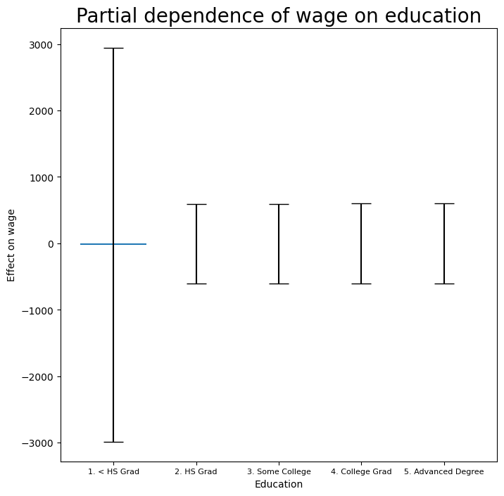
The model seems to be very flat, with especially high error bars for the first category. Let’s look at the data a bit more closely.
pd.crosstab(Wage['high_earn'], Wage['education'])
| education | 1. < HS Grad | 2. HS Grad | 3. Some College | 4. College Grad | 5. Advanced Degree |
|---|---|---|---|---|---|
| high_earn | |||||
| False | 268 | 966 | 643 | 663 | 381 |
| True | 0 | 5 | 7 | 22 | 45 |
We see that there are no high earners in the first category of education, meaning that the model will have a hard time fitting. We will fit a logistic regression GAM excluding all observations falling into this category. This provides more sensible results.
To do so,
we could subset the model matrix, though this will not remove the
column from Xgam. While we can deduce which column corresponds
to this feature, for reproducibility’s sake we reform the model matrix
on this smaller subset.
only_hs = Wage['education'] == '1. < HS Grad'
Wage_ = Wage.loc[~only_hs]
Xgam_ = np.column_stack([Wage_['age'],
                         Wage_['year'],
                         Wage_['education'].cat.codes-1])
high_earn_ = Wage_['high_earn']
In the second-to-last line above, we subtract one from the codes of the category, due to a bug in pygam. It just relabels
the education values and hence has no effect on the fit.
We now fit the model.
gam_logit_ = LogisticGAM(age_term +
                         year_term +
                         f_gam(2, lam=0))
gam_logit_.fit(Xgam_, high_earn_)
LogisticGAM(callbacks=[Deviance(), Diffs(), Accuracy()],
   fit_intercept=True, max_iter=100,
   terms=s(0) + s(1) + f(2) + intercept, tol=0.0001, verbose=False)
Let’s look at the effect of education, year and age on high earner status now that we’ve
removed those observations.
fig, ax = subplots(figsize=(8, 8))
ax = plot_gam(gam_logit_, 2)
ax.set_xlabel('Education')
ax.set_ylabel('Effect on wage')
ax.set_title('Partial dependence of high earner status on education', fontsize=20);
ax.set_xticklabels(Wage['education'].cat.categories[1:],
                   fontsize=8);
fig, ax = subplots(figsize=(8, 8))
ax = plot_gam(gam_logit_, 1)
ax.set_xlabel('Year')
ax.set_ylabel('Effect on wage')
ax.set_title('Partial dependence of high earner status on year',
             fontsize=20);
fig, ax = subplots(figsize=(8, 8))
ax = plot_gam(gam_logit_, 0)
ax.set_xlabel('Age')
ax.set_ylabel('Effect on wage')
ax.set_title('Partial dependence of high earner status on age', fontsize=20);
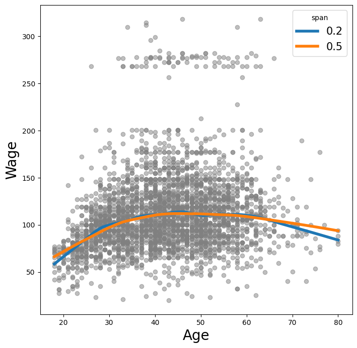
Local Regression#
We illustrate the use of local regression using the lowess()
function from sm.nonparametric. Some implementations of
GAMs allow terms to be local regression operators; this is not the case in pygam.
Here we fit local linear regression models using spans of 0.2 and 0.5; that is, each neighborhood consists of 20% or 50% of the observations. As expected, using a span of 0.5 is smoother than 0.2.
lowess = sm.nonparametric.lowess
fig, ax = subplots(figsize=(8,8))
ax.scatter(age, y, facecolor='gray', alpha=0.5)
for span in [0.2, 0.5]:
    fitted = lowess(y,
                    age,
                    frac=span,
                    xvals=age_grid)
    ax.plot(age_grid,
            fitted,
            label='{:.1f}'.format(span),
            linewidth=4)
ax.set_xlabel('Age', fontsize=20)
ax.set_ylabel('Wage', fontsize=20);
ax.legend(title='span', fontsize=15);